> ## Documentation Index
> Fetch the complete documentation index at: https://quantstruct.mintlify.site/llms.txt
> Use this file to discover all available pages before exploring further.

# Quickstart

> Generate personalized UI to guide your users with Lopus AI

## 1. Install the Lopus AI SDK

Install `lopus-ai` in your React project:

<CodeGroup>
  ```bash npm theme={null}
  npm install lopus-ai@latest
  ```

  ```bash pnpm theme={null}
  pnpm add lopus-ai@latest
  ```

  ```bash yarn theme={null}
  yarn add lopus-ai@latest
  ```

  ```bash bun theme={null}
  bun add lopus-ai@latest
  ```

  ```bash deno theme={null}
  deno install npm:lopus-ai@latest
  ```
</CodeGroup>

## 2. Set up shadcn/ui

Currently, the SDK requires you to setup `shadcn/ui` separately in order to render the generated components (we internally use these components for clean default styling). If you prefer installation guidelines given by the `shadcn/ui` website, head on to the [Installation](https://ui.shadcn.com/docs/installation) instructions.

If you're using a framework like Next.js, Gatsby, Remix or Astro, you can use the `shadcn/ui` CLI to set this up. If you're using plain React.js, head on to the [Manual Installation Guide](https://ui.shadcn.com/docs/installation/manual).

Install and initialize shadcn/ui in your React-based project:

<CodeGroup>
  ```bash npm theme={null}
  npx shadcn-ui@latest init
  ```

  ```bash pnpm theme={null}
  pnpm dlx shadcn-ui@latest init
  ```

  ```bash yarn theme={null}
  yarn dlx shadcn-ui@latest init
  ```

  ```bash bun theme={null}
  bunx shadcn-ui@latest init
  ```

  ```bash deno theme={null}
  deno run npm:shadcn-ui@latest init
  ```
</CodeGroup>

During initialization, answer the questions as you want.

## 3. Configure Tailwind CSS

Add the Lopus AI components to your `tailwind.config.ts` content array:

```ts {9} tailwind.config.ts theme={null}
import type { Config } from 'tailwindcss';

export default {
	darkMode: ['class'],
	content: [
		'./src/pages/**/*.{js,ts,jsx,tsx,mdx}',
		'./src/components/**/*.{js,ts,jsx,tsx,mdx}',
		'./src/app/**/*.{js,ts,jsx,tsx,mdx}',
		'./node_modules/lopus-ai/dist/**/*.{js,ts,jsx,tsx}', // Add this line
	],
	theme: {
		extend: {
			// ... rest of your theme config
		},
	},
	plugins: [require('tailwindcss-animate')],
} satisfies Config;
```

<Note>
  Make sure to add the highlighted line to your Tailwind config to properly
  style the Lopus AI components.
</Note>

## 4. Initialize the `useLopusChat` Hook

Import and initialize the `useLopusChat` hook in your React component:

```tsx ChatComponent.tsx theme={null}
'use client';
import { useLopusChat } from 'lopus-ai';

export default function ChatComponent() {
	const { messages, sendQuery, isLoading } = useLopusChat({
		apiKey: 'your_api_key_here',
	});

	return (
		<div>
			{messages.map((message, index) => (
				<div key={index}>{String(message.content)}</div>
			))}
		</div>
	);
}
```

<Note>
  Replace `your_api_key_here` with your actual Lopus AI API key. You can find
  your API key in the [dashboard](https://dashboard.lopus.ai).
</Note>

The `useLopusChat` hook provides:

* `messages`: An array of chat messages

* `sendQuery`: A function to send new messages

* `isLoading`: A boolean indicating if a response is being generated

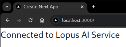
You should see a confirmation that you are authenticated:

<Frame caption="Authentication confirmation from Lopus AI">
  <img src="https://mintcdn.com/quantstruct/Bf_2o5pJp9znI0yX/images/lopus_authentication.png?fit=max&auto=format&n=Bf_2o5pJp9znI0yX&q=85&s=516bf9904e340b98929e4d02c3a8fa66" alt="" width="494" height="187" data-path="images/lopus_authentication.png" />
</Frame>

## 5. Design Chat Components

Create 3 necessary components for Messages, Message List, and Chat Input. Each component includes error handling, type checking, and styling.
<CodeGroup>
  ```tsx Message.tsx theme={null}
  import React, { ReactElement, JSXElementConstructor } from 'react';

  export function Message({ message }: MessageProps) {
    return (
    	<div
    		className={`mb-2 p-2 rounded ${
    			message.sender === 'USER'
    				? 'bg-blue-600 text-white ml-auto'
    				: 'bg-gray-200 text-black'
    		} max-w-[80%]`}
    	>
    		{(() => {
    			switch (typeof message.content) {
    				case 'string':
    					return <div>{message.content}</div>;
    				case 'object':
    					if (React.isValidElement(message.content)) {
    						return message.content;
    					}
    					return <div>{JSON.stringify(message.content)}</div>;
    				default:
    					return <div>{String(message.content)}</div>;
    			}
    		})()}
    	</div>
    );
  }

  interface Message {
  content: string | ReactElement<unknown, string | JSXElementConstructor<any>> | Record<string, unknown>;
  sender: 'USER' | 'ASSISTANT';
  }

  interface MessageProps {
  message: Message;
  }

  ```

  ```tsx MessageList.tsx theme={null}
  import React, { ReactElement, JSXElementConstructor } from 'react';
  import { Message } from './Message';

  export function MessageList({ messages, isLoading }: MessageListProps) {
  	return (
  		<div className="flex-1 overflow-auto mb-4">
  			{messages.map((message, index) => (
  				<Message key={index} message={message} />
  			))}
  			{isLoading && <div className="text-gray-500">Loading...</div>}
  		</div>
  	);
  }

  interface Message {
  	content: string | ReactElement<unknown, string | JSXElementConstructor<any>> | Record<string, unknown>;
  	sender: 'USER' | 'ASSISTANT';
  }

  interface MessageListProps {
  	messages: Message[];
  	isLoading: boolean;
  }


  ```

  ```tsx ChatInput.tsx theme={null}
  import React, { useState } from 'react';

  export function ChatInput({ onSubmit, isLoading }: ChatInputProps) {
  	const [input, setInput] = useState('');

  	const handleSubmit = async (e: React.FormEvent) => {
  		e.preventDefault();
  		if (!input.trim()) return;

  		try {
  			await onSubmit(input);
  			setInput('');
  		} catch (error) {
  			console.error('Failed to send message:', error);
  		}
  	};

  	return (
  		<form onSubmit={handleSubmit} className='flex gap-2'>
  			<input
  				type='text'
  				value={input}
  				onChange={(e) => setInput(e.target.value)}
  				className='flex-1 p-2 border rounded text-black placeholder-zinc-400 border-zinc-600 focus:outline-none focus:border-blue-500'
  				placeholder='Type your message...'
  			/>
  			<button
  				type='submit'
  				disabled={isLoading}
  				className='px-4 py-2 bg-blue-600 text-white rounded disabled:bg-zinc-600 disabled:text-zinc-400 hover:bg-blue-700'
  			>
  				Send
  			</button>
  		</form>
  	);
  }

  interface ChatInputProps {
  	onSubmit: (message: string) => Promise<void>;
  	isLoading: boolean;
  }
  ```
</CodeGroup>

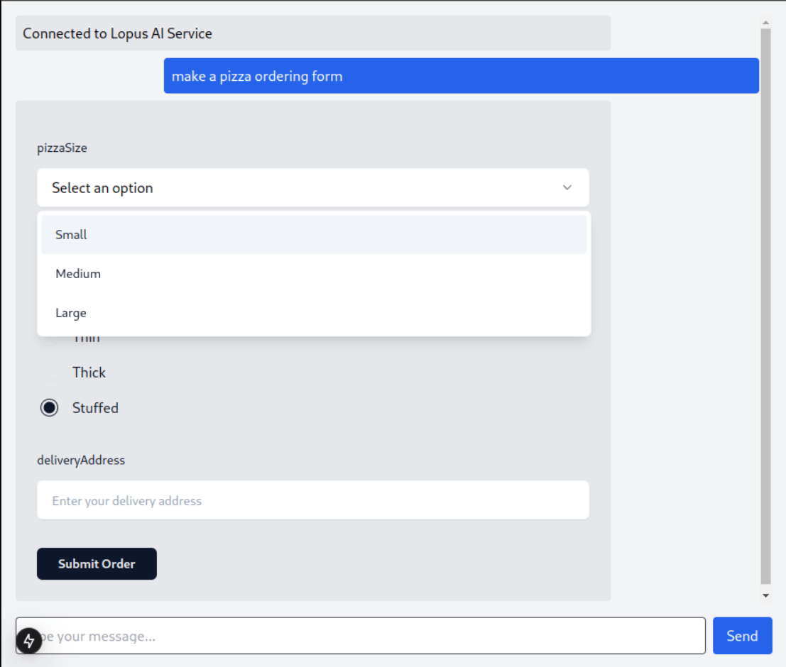
Make sure to update your `ChatComponent.tsx` to use the components:

```tsx ChatComponent.tsx theme={null}
'use client';
import { useLopusChat } from 'lopus-ai';
import { MessageList } from './components/MessageList';
import { ChatInput } from './components/ChatInput';

export default function ChatComponent() {
	const { messages, sendQuery, isLoading } = useLopusChat({
		apiKey: 'your_api_key_here',
	});

	return (
		<div className='flex flex-col h-screen p-4 bg-gray-100'>
			<MessageList messages={messages} isLoading={isLoading} />
			<ChatInput onSubmit={sendQuery} isLoading={isLoading} />
		</div>
	);
}
```

<Frame as="div" caption="Lopus Chat Component">
  <img src="https://mintcdn.com/quantstruct/Bf_2o5pJp9znI0yX/images/lopus_chat_component.png?fit=max&auto=format&n=Bf_2o5pJp9znI0yX&q=85&s=0c58d0fce920526fce399607236c9adb" alt="" width="1107" height="940" data-path="images/lopus_chat_component.png" />
</Frame>

For a complete implementation with advanced features like error handling and component rendering, see our example app:

## Next Steps

* Learn how to [Render Markdown Messages](/markdown-messages)

* Learn about different [Message Types](#message-types) supported by Lopus AI
